Design pane
The Design pane is where you apply CSS to elements. It is divided into two sub-tabs: Element, which manages the selectors attached to an element, and Style, which exposes every CSS property as a visual control.
Element sub-tab
The Element sub-tab shows the HTML identity of the selected element and lets you manage the classes and ID attached to it.
Element tag display
At the top of the sub-tab, the element’s HTML tag is shown (e.g., div, h2, button). This is read-only — to change the tag type, use the canvas context menu or the Outline pane.
Managing classes
Below the tag, the Classes field lists every class currently applied to the element. Each class appears as a chip.
- Add a class: Click the + button or click the classes field and type a new class name, then press Enter .
- Remove a class: Click the × on any class chip.
- Select a class to style: Click a chip to make it the active class. Edits in the Style sub-tab will apply to that class’s CSS rule.
Class color indicators
Each class chip has a color accent on its left edge. The color tells you what kind of rule the class belongs to:
| Color | Meaning |
|---|---|
| Blue | A class you created in this project |
| Green | A framework utility class (Foundation, Bootstrap, or Materialize) |
| Orange | A class inherited from a global or imported stylesheet |
| Gray | A class that has no CSS rules attached yet |
Element ID
Below the Classes field, the ID input lets you assign a unique id attribute. IDs are used for anchor links, JavaScript targeting, and CSS specificity. Each ID must be unique per page.
Style sub-tab
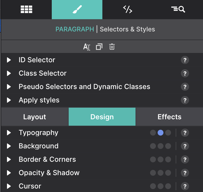
The Style sub-tab exposes the full set of CSS properties for the active class shown in the Element sub-tab. Changes here update the CSS rule for that class — they affect every element on the page that shares the same class.
CSS control groups
Properties are organized into collapsible groups so you can focus on what matters:
| Group | What’s inside |
|---|---|
| Typography | Font family, size, weight, line height, letter spacing, text align, color |
| Dimensions | Width, height, min/max constraints, overflow |
| Spacing | Margin and padding (individual sides or shorthand) |
| Background | Color, image, gradient, repeat, size, position |
| Border | Width, style, color, radius (per corner) |
| Shadow | Box shadow and text shadow builder |
| Display & Layout | Display mode, Flexbox and Grid controls |
| Position | Position type, top/right/bottom/left, z-index |
Click a group header to expand or collapse it. Groups with active values show a dot indicator so you can spot applied styles at a glance.