Workspace at a glance
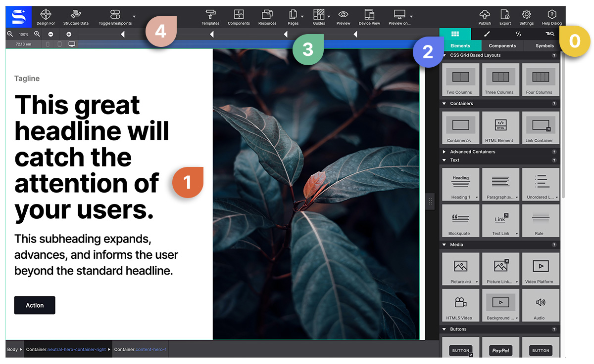
The Site Designer workspace is organized into distinct zones. Understanding each one helps you work faster and find settings without hunting.

Workspace zones
Top toolbar
The horizontal bar across the top of the window. Contains:
- Page Manager (leftmost icon) — Add, rename, reorder, and delete pages in your project.
- Resources — Upload and manage images, fonts, and files.
- Templates — Browse and apply page templates.
- Components — Insert pre-built component blocks from Foundation, Bootstrap, Materialize, or your saved components.
- Live Preview — Opens a live preview in your system browser with a local server.
- Feature Queries — Add
@supportsCSS rules for progressive enhancement. - Structured Data — Add JSON-LD structured data blocks (Schema.org).
- Preview in Browser — Quick-open the current page in your default browser.
- Undo / Redo — Standard undo/redo with keyboard shortcuts ⌘Z / ⌘⇧Z .
- Settings — Export, publish, and project metadata.
The canvas (center)
The large central area where you design. It renders in a real browser engine, so what you see in the canvas is what visitors will see in their browser.
Key canvas behaviors:
- Click an element to select it — a blue border appears.
- Double-click a text element to edit it inline.
- Right-click anywhere to open the context menu.
- The breadcrumb bar at the bottom of the canvas shows the current selection path.
Width slider (bottom of canvas)
The horizontal slider below the canvas controls the preview viewport width. Drag left to simulate narrow screens; drag right for wide. Dashed vertical lines mark your breakpoints.
- Current width in pixels is shown on the right side of the slider.
- Click a breakpoint line to jump directly to that width.
- Enter breakpoint mode with the toggle button to edit styles at that specific width.
Control panes (right panel)
The right-side panel has five tabs, each giving access to a different set of controls for the selected element:
| Tab | Icon | What’s inside |
|---|---|---|
| Content | Text icon | Edit text, links, src, alt, custom attributes |
| Design | Brush icon | Classes/IDs (Element sub-tab) + all CSS visual controls (Style sub-tab) |
| Effects | Sparkle icon | Transitions, hover effects, animations, filters |
| Outline | Tree icon | Full DOM tree of the page; drag to restructure |
| CSS | Code icon | Computed CSS for the selected element (read-only) |
Status bar (bottom)
A thin bar at the very bottom of the window showing:
- Current file path
- Auto-save status
- Active framework (Foundation / Bootstrap / Materialize / None)
Collapsing and resizing panels
- Drag the border between the canvas and control panes to resize the pane width.
- Collapse the right panel by clicking the collapse arrow at its top-left corner.
Display preferences
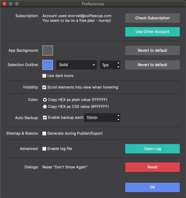
Under Settings → Preferences you can change:
- Canvas zoom level
- Grid overlay visibility
- Element highlight color
- Default element display mode